The Evolution of a Hypnotherapist’s Logo
Hearts in Harmony Hypnosis changed their logo as necessary until the branding was magical
When Hearts in Harmony Wellness owner, Kelly Tallaksen, created a new division that focused on hypnosis in 2011, a new banner had to be created for the new website.
This header was put together quickly and the client absolutely loved it. At that point, Kelly was upkeeping her own website, including writing blog posts and updating the software. The theme I created didn’t need updating since it was a simple theme with basic WordPress functions. Years later Kelly decided to have someone on UpWork make her an official logo that she could use on her other material.
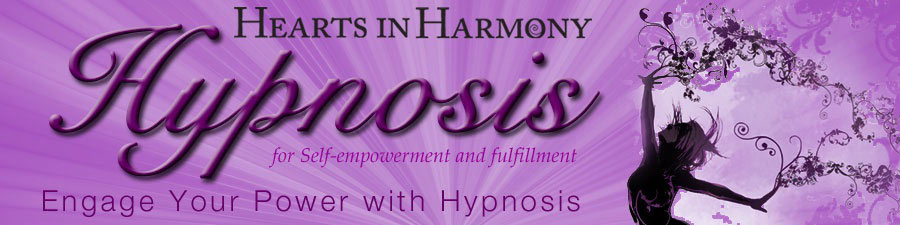
Using the idea of the banner I created for her website, the artist came up with the following logo. Kelly thought it was okay, but didn’t have the joie de vivre that she wanted to impart. Below is the logo with the new banner.
Eventually Board Certified Hypnotherapist Kelly Tallaksen contacted me to say she needed a whole new website with full ecommerce store, and other functionalities. And she often lamented on her choice of artist for the logo. At that point, I told her I would unf*ck her logo and work it into the new website estimate. She was a little unsure about falling away from her established look, and I reassured her that it would still be recognizable as an incarnation of each other. This is why I opted to use the same script letters she was partial towards.
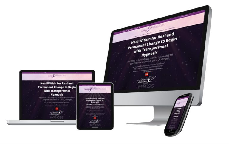
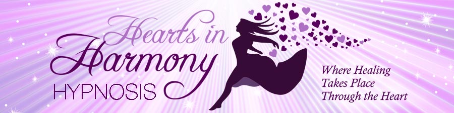
After showing her the new logo, she immediately felt great about her branding again and it showed in her joy when talking about her “look and feel.” Here is a copy of the new logo. It’s not presented as a banner as banner artwork for websites is so yesterday. Now we use logos work them into the site for various screen sizes.
![]()
One of the main reasons why I chose to focus on the word Hypnosis is one of the pain points Kelly had with the logo from UpWork: People were assuming her business was for couple’s counseling. There’s an existing company using the name “Hearts in Harmony,” and people would call her looking for love advice. While hypnotherapy can help you when you have a broken heart, it’s not a loveline.
Kelly loves her logo, her branding, and everything that she puts together for her business. She even uses the logo herself to create collateral material as do-it-yourself print places such as Staples or VistaPrint. ![]() Once you have a branded look and feel, your business will be professional in the eyes of potential and existing clients. Now her logo states exactly what the core of her business is about: Hypnosis. There are no longer phone calls that waste her time and frustrate people that assume her business is something else.
Once you have a branded look and feel, your business will be professional in the eyes of potential and existing clients. Now her logo states exactly what the core of her business is about: Hypnosis. There are no longer phone calls that waste her time and frustrate people that assume her business is something else.
TL;DR: Change your logo without fear, don’t settle for anything less than awesome.